Back
Nanmou
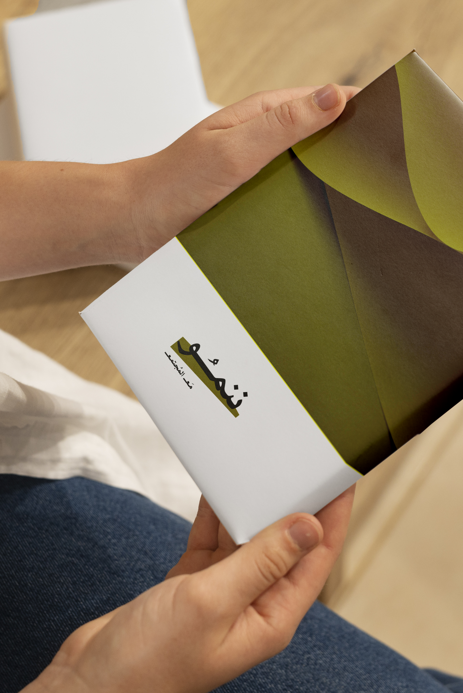
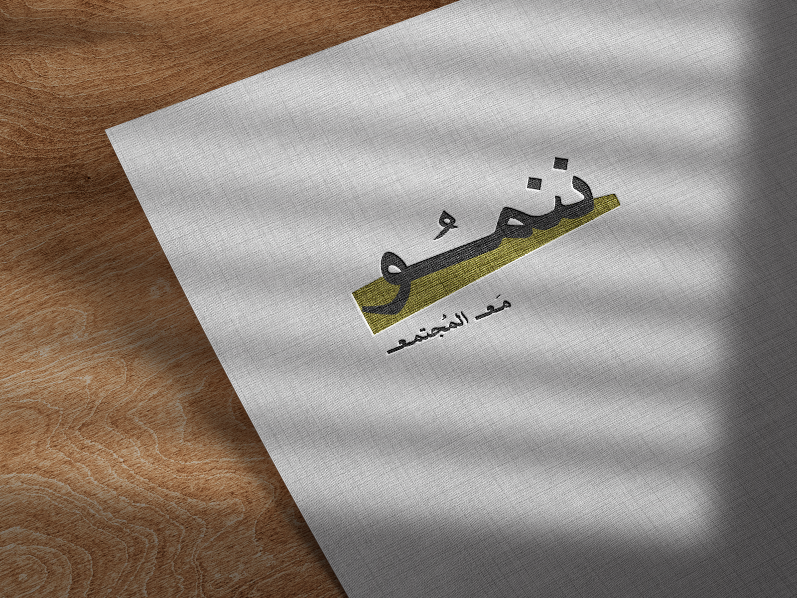
Nanmou is an Emirati brand and community podcast. Its logo is designed using Arabic typography to reflect authenticity and Emirati identity, while the green color symbolizes growth, continuity, and life. The design is anchored by a visual base beneath the name, representing stability as the starting point of growth, while the word community is written in a modern, youthful style that feels closer to people and society
ننمـو هو براند إماراتي وبودكاست مجتمعي، صُمّم شعاره بالخط العربي ليعكس الأصالة والهوية الإماراتية، بينما يرمز اللون الأخضر إلى النمو، الاستمرارية، والحياة. يعتمد التصميم على قاعدة بصرية أسفل الاسم، تجسّد فكرة الثبات الذي ينطلق منه التطور، في حين كُتبت كلمة المجتمع بأسلوب حديث وشبابي أقرب للمجتمع والناس